What feature would make u NOT buy a watch?

unAwsome

Member
Curious about what break-dealer features would make u abstain from buying a watch? Actually, I never thought about this aspect before, until I recently watched a YT video with a guy talking about features he never embraces in a watch. It got me thinking. For example, he never would have a Pepsi Rolex because of its red and blue bezel, or date windows that he finds screwing up all the design. Is it all bullsh*t or there are indeed features that influence the buying decision? 🧐👀
 

RESTIONY

Member
Skeleton dials, eewwww😖 make me feel afraid of them… also, maybe most of the community will disagree with me, but don’t quite embrace the jam stones, diamonds, and stuff like that on a man’s watch… these might be expensive and valuable and all you want, but definitely wouldn’t opt for one… gems are for women exclusively
 

salmeari

Active member
diamonds are welcome but only when not too many of them. I'm not really fond of flamboyant watches. minimals are more appreciated by me.

regarding features, don’t rally know if it counts, but can’t stand G shock watches. I’m intolerant of them. And don’t try to convince me about the contrary 🙈I know you’ll tell me how fabulous they are in sports activities, bla bla. But no, no, no. So there is not only 1 feature I can’t stand, there is everything I can’t stand in g-shocks…sorry)
 

DanielDJZI

Well-known member
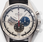
While I can understand the point when watchmaking brands try to integrate as many functions as possible, I can’t really understand how it is possible to neglect some basic design aspects that make these functions useless. So, can’t really say what function would determine me not to buy a watch, but I can certainly say what design errors I can’t stand. A good example is the zenith El Primero watch. Plenty of functions and plenty of design mistakes. Everything looks pretty nice at first glance until you detect the errors of subdials. These overlap one another, making it impossible to read the other two apart from the hour Chrono. The watch house did make some improvements in the next lineup iterations, but where were the designers looking when this model was released?! Didn’t really get the logic of Zenith with this line.
 

Attachments

  • Screenshot 2022-10-10 at 14.36.36-min.png
    Screenshot 2022-10-10 at 14.36.36-min.png
    459.7 KB · Views: 0

Almagest

Active member
to be honest, open-heart watches seem a bit creepy to me 🫣 it’s like the dial has been broken and a part of it has flown away😁 I think watch designers expose the watch heart to show “their inner beauty”, right?) but, I really can’t see any beauty in there) perhaps a true watch connoisseur would appreciate contemplating the inner mechanism, but such a watch would definitely NOT be my choice) and the “harder” version: skeleton watches….eewww)
 

AdESTORn

Active member
I’ll enumerate some of them, not really sure If they are “features”, but characteristics-for sure…

-overcolored dial, orange, red. I don’t accept it even in ladies’ watches, these are too flamboyant, a little bit vulgar and tasteless;

-mercedes hands: impairs overall legibility and don’t really think its a good design move;

-panda dials. These are like watches for kids. I can’t take seriously a person who wears panda dials
 

BrIerNAN

Active member
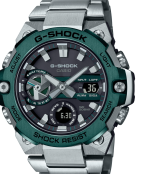
Some g-shock watches are too difficult to0 be read. So I’d avoid g-shocks with over-saturated dials. Given they already have plenty of functions, why make them even more difficult to read?
The subdials have different ways of displaying data, one is electronic, the other is dots-like and the battery subdial looks too complicated. Millions of writings on the dial. Too heavy, too much, too many useless dial details impairing the readability
 

Attachments

  • Screenshot 2022-10-10 at 20.41.18-min.png
    Screenshot 2022-10-10 at 20.41.18-min.png
    474.1 KB · Views: 0

RESTIONY

Member
Some g-shock watches are too difficult to0 be read. So I’d avoid g-shocks with over-saturated dials. Given they already have plenty of functions, why make them even more difficult to read?
The subdials have different ways of displaying data, one is electronic, the other is dots-like and the battery subdial looks too complicated. Millions of writings on the dial. Too heavy, too much, too many useless dial details impairing the readability
"dots'like"😆
 

Nobbing

Well-known member
I can accept everything, except Rolex watches. Don’t really love either the brand or its watches. I mean I can’t see anything special in them, except for an overpowered marketing strategy. Watches like watches, nothing more and nothing less. Too much hype around them. Too expensive for the same features as many other brands do. Being a mass-market product, it exaggerates the price. So much fever around the Cellini, but there are phenomenal watches instead, costing far cheaper. So why so much puff around it? I totally support the attempts of all other brands be they big or less big. But Rolex has relaxed a lot and makes watches only based on its big name
 

YellowSnowman

Active member
I can accept everything, except Rolex watches. Don’t really love either the brand or its watches. I mean I can’t see anything special in them, except for an overpowered marketing strategy. Watches like watches, nothing more and nothing less. Too much hype around them. Too expensive for the same features as many other brands do. Being a mass-market product, it exaggerates the price. So much fever around the Cellini, but there are phenomenal watches instead, costing far cheaper. So why so much puff around it? I totally support the attempts of all other brands be they big or less big. But Rolex has relaxed a lot and makes watches only based on its big name
That was tough)) like any watch brand, Rolex has its pros and cons. but don’t really agree that the entire portfolio has no value at all) after all the brand gained its reputation based on decades of experience. I see your position more like a defensive one, and not an objective one)
 

cheetahapple

Active member
skeletons...skeletons...skeletons... sorry those who wear them. But I really have a phobia with them. their design is like having no design at all. and I know the watch designers' point: the idea is to display the inner mechanism and its intricacy. However, these watches definitely have a certain and restricted target audience. and i'm not part of it
 

diaboliquerye

Well-known member
There are no specific features I dislike, but there r specific consumers I can’t stand… people having GMT watches when they don’t specifically need a GMT😖 they just buy them…idk why exactly if they just don’t travel, don’t really need the different timezones feature and don’t even know how to use and adjust it…what’s the point 🧐
 

LIgHtere

Well-known member
Screenshot 2022-10-12 at 10.03.28-min.png


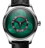
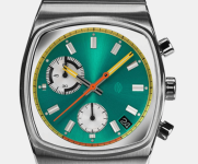
Screenshot 2022-10-12 at 10.03.05-min.pngCan’t really refer to a specific feature, but what I dislike in watches is their “too designy” aspect. Some designers seem to exaggerate their vision and the result is simply disgusting. Sometimes it’s about too many colors on the dial, sometimes it can be a dial that is hardly legible due to an “over-designed” aspect.. ill show it with pics…
 

EmPoWeReD

Active member
I don't really understand the asymmetrical design in watches that affects readability. I really think that a watch should tell the time right away when u look at it, especially when its about racer or pilot's watches. i'm not saying that I hate them, but I would definitely avoid having one...
with all due respect to the iconic brand, but how am I supposed to turn this watch to read it accordingly?!
Screenshot 2022-10-12 at 13.52.31-min.png
 

hATeAndLovewaTCheS

Well-known member
I can accept everything, except Rolex watches. Don’t really love either the brand or its watches. I mean I can’t see anything special in them, except for an overpowered marketing strategy. Watches like watches, nothing more and nothing less. Too much hype around them. Too expensive for the same features as many other brands do. Being a mass-market product, it exaggerates the price. So much fever around the Cellini, but there are phenomenal watches instead, costing far cheaper. So why so much puff around it? I totally support the attempts of all other brands be they big or less big. But Rolex has relaxed a lot and makes watches only based on its big name
don't agree...I might accept that the Pepsi collection or the Daytona is indeed for a specific audience… but the Oyster Perpetual or the Sky-Dweller is hard to ignore considering the design and the technical structure.
 

Ghosterry

Well-known member
Skeletons would be the only dealbreaker for me/// the transparent caseback showing the inner components of a watch is pretty enough to get familiar with the interior details. The face of the watch has to show the artistry of the brand in designing great dials, not exposing the inner mechanism of the watch…
 
Top