From my point of view, a website selling something should be more than just an online marketplace. It should be aesthetically clean, with an attractive design. Moreover, it should have easy and friendly architecture, so that the youngest and the oldest visitor can easily navigate it. Among hundreds of replica watch stores, I have discovered very attractive websites, as well as surprisingly poor sites. From my own experience, I am sure that online stores with clean and appealing interfaces have a higher conversion rate. For those who are new in the website field, the conversion rate means the percentage of visitors that become real customers that buy a certain product from the online store. Therefore, having good items for sale is not enough. It also requires a great design for the site, as well as an intuitive menu.
I have recently discovered trustytimewatch.com online store. This website is for customers who seek replica watches. After navigating a little bit, here are some notes to consider, so that you know what to expect when visiting it.
General Overview
As just recently mentioned, this store is intended for customers who want to buy a replica timepiece. This is not one of those websites that offer different replica goods. It only focuses on watches from different brands. In case you need an online store integrating several replica goods (watches, shoes, bags, etc…all in one), top-rated stores can help you with some suggestions.
Generally speaking, this website offers a wide variety of brands. From Blancpain replicas to IWS, including Breguet, and Bell&Ross. On the whole, there are about 20 watch brands in the portfolio of this website. However, it is a bit hard to say the exact number of brands available, because the site architecture is very, very messy, unfortunately.
Another strange thing regarding the watch collection is that the store lacks Rolex replica watches. Rolex admirers won’t find suitable options here for them.
What do I mean by “messy”?
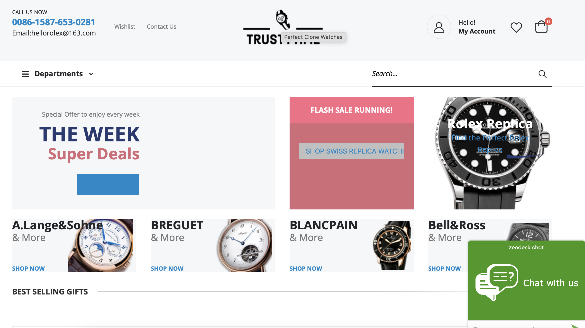
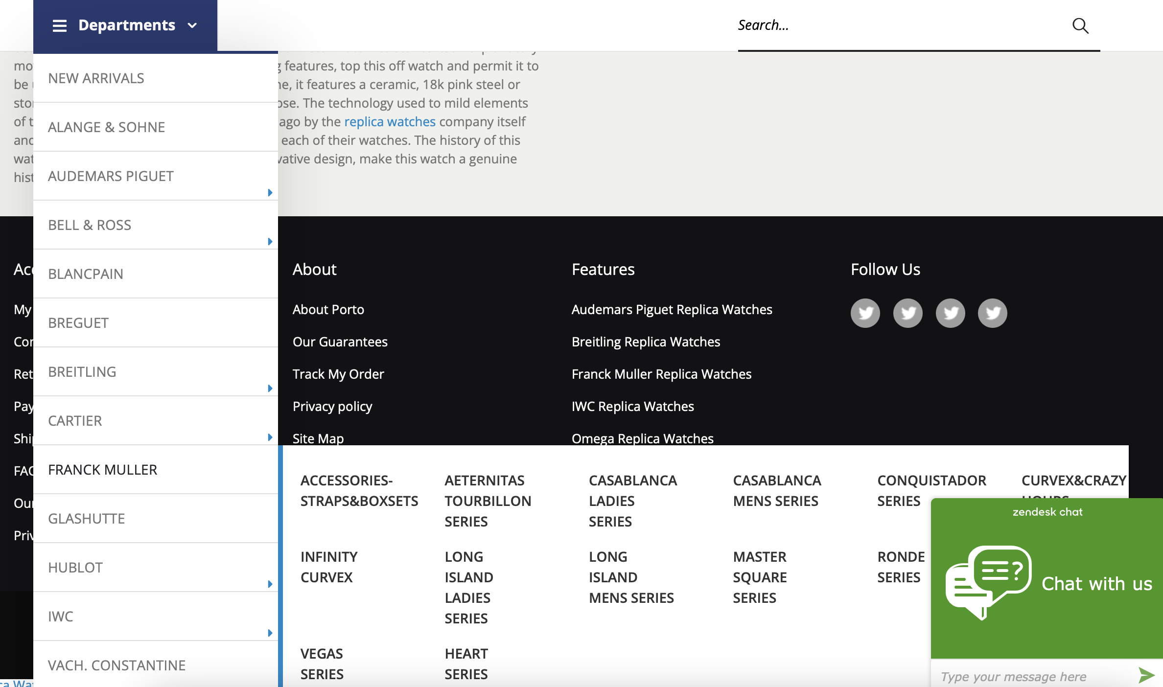
I, usually, try to focus on the positive aspect of a website, trying to identify its benefits. Sad to say that the first impression of trustytimewatch.com is that it is a “messy” website. As you can see in the picture above, this is how the brand collection is presented. I hope you agree that “messy” is no exaggeration. The chat overlays the brand listing. The multi-colored sections impair my concentration and I get lost in the multitude of messages from the advertising (banner) section. It took me about 5 minutes to “digest” the banner info.
The clearest message I understood from the homepage is that the store offers free shipping on all orders over 99$, offers a 100% money back guarantee, and online support 24/7. This information is clear enough because it is placed within accurate frames. For the rest of the homepage, the asymmetry of the frames, the “rainbow” of colors, and the content passage at the bottom of the page look just amateurish, unprofessional, and without any trace of good taste.
In case you want to get acquainted with the brand portfolio, you have to click on the “Departments“ section. I have to let you know that you will come across a little trouble at this point. When you scroll down the page to see the whole brand listing, it will not go till the end. The brand listing doesn’t fit into the homepage structure and size. Therefore, you won’t be able to fully see the brands’ portfolio.

Navigation issues
Usually, I never use a mouse during navigation, since I don’t have one. I adore maneuvering my MacBook through my trackpad. I have to say that there is a navigation issue with this store since I can’t easily scroll up and down the pages, without swiping up or down multiple times. Alternatively, I have to use my keyboard keys for this action for smoother scrolling. Either way, those who prefer two fingers trackpad scrolling, will find this store pretty disturbing, unfortunately.
Prices options
It is not excluded that some visitors don’t pay attention to the website’s aesthetic aspect. All that matters are the prices. Honestly, I don’t share the same vision. If a store claims to offer Swiss replica watches, the design of the store should be perfect. It is all about respect towards the customer. And sincerely speaking, this website doesn’t really convey respect, from the design point of view. But, let’s speak about prices, in particular.
trustytimewatch.com has different price options. It has cheap replicas, as well as expensive replica timepieces. To see the price range, you have to select a certain brand category and use the price filter right above the listing. Get ready to see inaccurate listing pages (again). The price filter allows you to adjust the prices from highest to lowest and vice versa.
Let’s take the Breitling collection, as an example. The prices from low to high include a range from $98 to $8,908. Once again: $8,908 (no mistake).

Another example
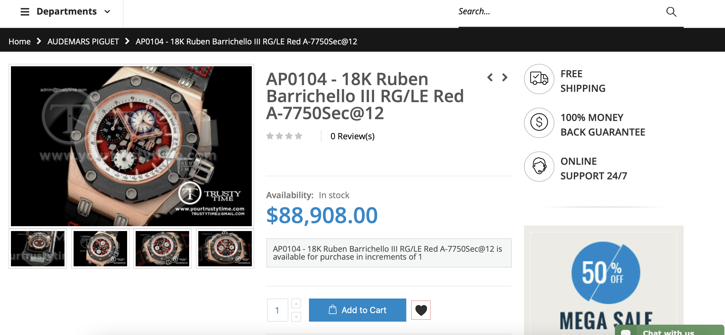
Let’s take another example: Audemars Piguet replica watches. The price range is $128-$88,908. Guys, let me tell you that this is the first time I come across such prices for replica watches. If I had such money, I would definitely go for a genuine Swiss watch :).
I was really excited to discover the features and materials used in the $88,000 replica watch. But, unfortunately, no description is available for any watch. I know plenty of stores that propose pretty expensive replicas. But, all of them come with a spectacularly attractive design and a full description of the technical features. There, you clearly know what features and quality grades contribute to the price formation. In contrast, trustytimewatch.com not only offers illogical prices but lacks any detailed explanation as well.
Warranty Policy
Glad to mention one positive feature of trustytimewatch.com: it offers a one-year warranty for all replica watches. In addition, the warranty covers water damage, as stipulated on the Our Guarantee page. However, it is hard to find some specific information about the extent of water resistance for every timepiece. In case you plan to buy one, I suggest you discuss this aspect with the customer care representatives.
Summing up
This is a pretty interesting website from different perspectives. The contact email of the store is “[email protected]”. However, no Rolex replica watches are available here. By the way, this is the same email address as on plenty of other replica stores. Only I find it funny?!
Seriously speaking, the website is tremendous in terms of accuracy and design. Maybe, visitors with no idea how an online store should look will accept it. But, those with some basic knowledge about aesthetics and web design will share my opinion, no offense. The most attractive thing is the 1-year warranty assurance. As for the rest, the store didn’t convince me that its replica watches at 8,000$ are worth.

